Blog | Paper Assets
An Introduction to Charts in Technical Investing
Investing in the stock market can be a daunting prospect, especially if you are new to the game
Rich Dad Paper Assets Team
June 01, 2023
Robert Kiyosaki often impresses how important it is to understand the language of money. Just like doctors have to understand the language of medicine or lawyers have to understand the language of the legal system, if you want to be a successful investor, you also have to understand how to talk like an investor.
The reality is that the stock market has a language of its own, and if you want to make informed investment decisions, you need to understand that language.
One way that stock investors speak about the stock market is in charts, which visually depicts the movements of stocks over time and provides valuable insights into potential investment opportunities.


In this post, we’ll introduce you to some basic stock market investing charts and how to interpret them.
-
Line Charts: The Simple Start
Let's start with the simplest type of chart - the line chart. This type of chart plots the closing price of a stock at regular intervals - daily, weekly, monthly - over a specified period.
The points are then connected to form a line, making it easy to track the stock's price trend. Here’s what one looks like:
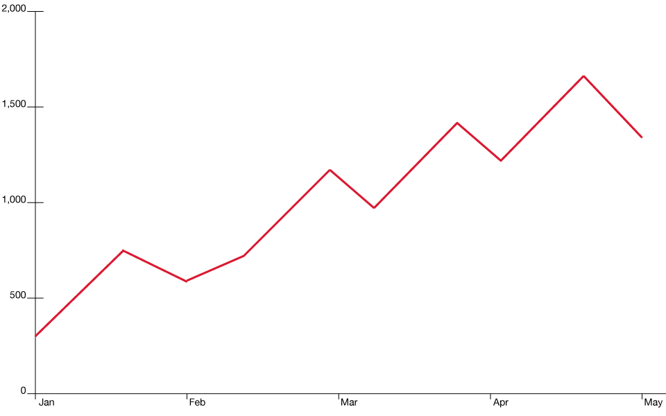
While line charts may not provide in-depth information like other chart types, they offer a quick and straightforward way to get a sense of a stock's overall price movement.
As both Robert Kiyosaki and Andy Tanner are so fond of teaching, simplicity can lead to clarity. By focusing on the overall trend of a stock's price movement, you can gain insight into its potential trajectory and make informed investing decisions.
-
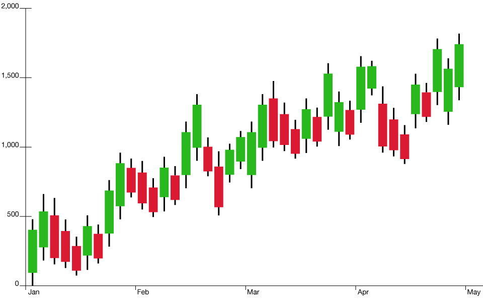
Bar Charts: A Step Further
A bar chart goes a step further than a line chart. Each bar in this chart represents a specific period (day, week, month) and displays the opening, closing, high, and low prices for that period. The vertical line indicates the trading range (high to low), while the horizontal notches on the bar mark the opening and closing prices. Here’s an example of what they look like:

This chart provides more detailed information about the price action of a stock during each period, giving a better sense of market sentiment.
Rich Dad said, “In order to understand a market, you must understand its mood.” A bar chart offers just that—a look into the mood of a market. By observing the length and direction of the bars, you can gauge the strength and direction of the trend.
These can also be very helpful in advanced technical analysis, where you can see patterns that offer the ability to make educated guesses on how a stock will perform based on a number of different patterns types in a bar chart.
-
Candlestick Charts: Reading the Market’s Mood
Candlestick charts are arguably the most popular among traders. They depict the same information as bar charts - open, close, high, and low - but in a visually appealing format. They look like this:
Each candlestick represents a specific time period and shows the price range (body) and extreme highs and lows (shadows or wicks).
The body is colored differently depending on whether the closing price is higher (often white or green) or lower (usually black or red) than the opening price. Candlestick charts offer rich insights into market psychology and potential reversals in trends, aligning well with Andy Tanner’s emphasis on using technical analysis for forecasting price movements, which you can learn in more detail in his course, “Four Pillars of Investing”.
-
Point and Figure Charts: Ignoring the Noise
Point and Figure (P&F) charts are a unique breed. They record price changes in columns of X's (representing rising prices) and O's (representing falling prices), ignoring time altogether. It looks like this:
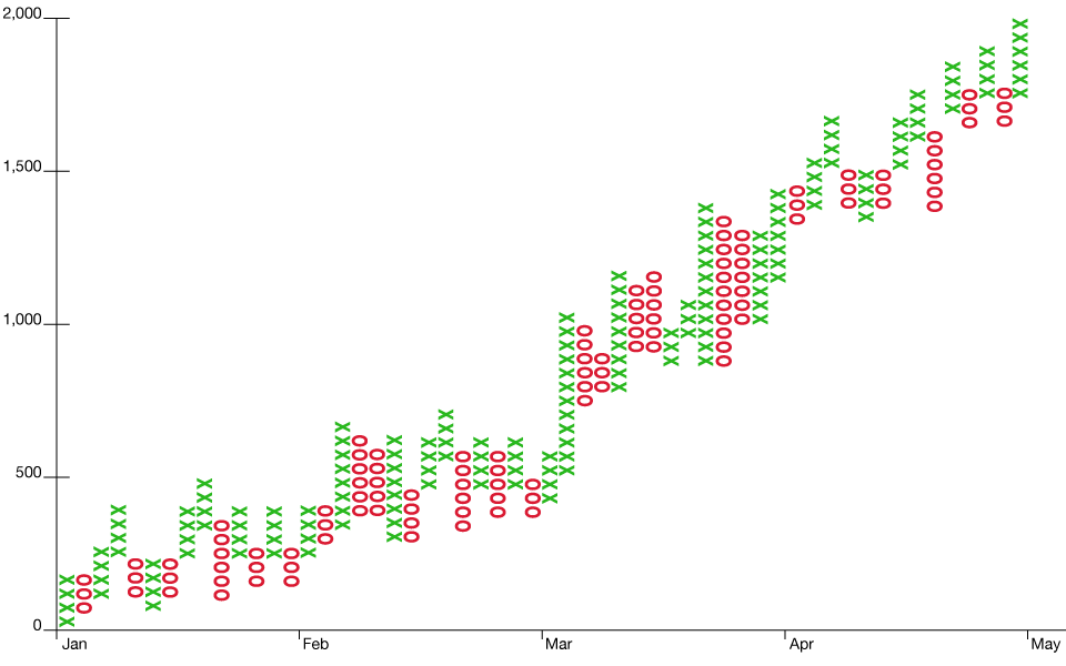
This chart only plots significant price changes, eliminating minor fluctuations and helping you focus on critical trends.
P&F charts align with Robert’s philosophy of going against the herd. By eliminating the noise of insignificant price movements, these charts help you identify significant trends that others might overlook. With P&F charts, you can gain a deeper understanding of a stock's long-term potential and make more informed investing decisions.
-
Volume Charts: Combining Price and Activity
Volume charts are often used in conjunction with other chart types, displaying the number of shares traded during a specific period and adding a crucial dimension to price analysis - trading activity. They look like this:
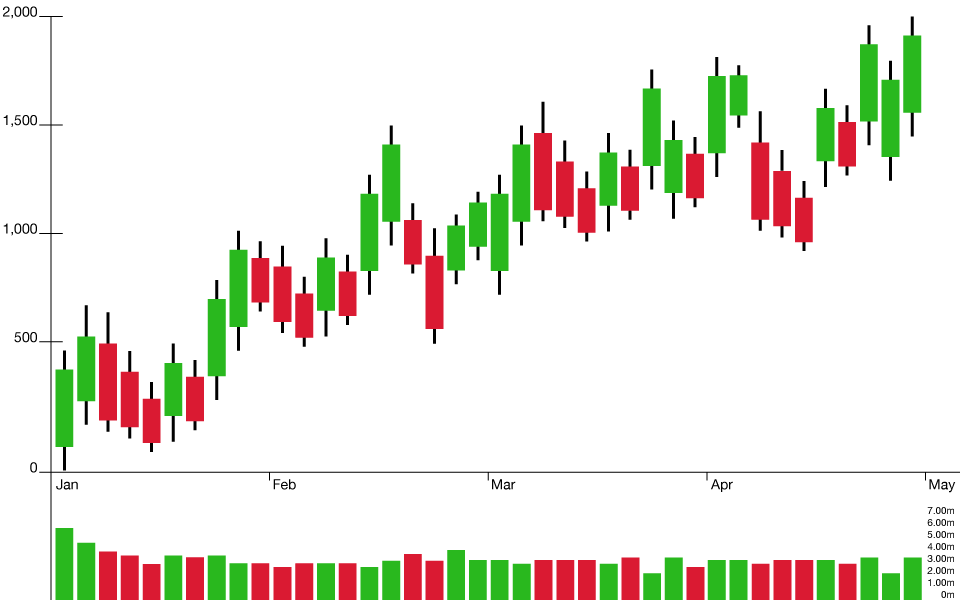
A sudden surge in volume could indicate strong investor sentiment, adding confidence to a perceived price trend.
Both Robert and Andy encourage understanding—and not following—the herd. The addition of volume analysis allows you to understand where the herd is headed, and it gives you key information on what might be potential balloons or sell offs. For instance, if a company has great fundamentals but trading volume is high for selling, the price might go down and it is a good time to buy. Buying a solid asset when others are panicking is a key way to build wealth over the long haul. By combining price analysis and trading activity, you can gain a more nuanced understanding of potential investment opportunities.
Conclusion: The Art and Science of Reading Stock Charts
As Robert says, "Investing is not a science, but an art." While stock market charts can provide valuable insights, they should not be used in isolation. Fundamental analysis - understanding the company's financial health, industry trends, and broader economic indicators - should go hand in hand with technical analysis.
By combining different types of stock market charts and fundamental analysis, you can gain a deeper understanding of potential investment opportunities. However, investing always carries risks, and it's essential to remain mindful of them. With continuous education and a holistic approach to investing, you can enjoy the journey of investing while making informed decisions that align with your financial goals.
Understanding stock market charts is crucial to making informed investment decisions. Each chart type offers unique insights into a stock's price movement and market sentiment. By combining different chart types and fundamental analysis, you can gain a more nuanced understanding of potential investment opportunities.
However, investing always carries risks, and it's essential to remain mindful of them. With continuous education and a holistic approach to investing, you can enjoy the journey of investing while making informed decisions that align with your financial goals.
Original publish date:
June 01, 2023